
I used to think blue was a safe, boring choice for a wall. Then I hung a deep navy print in our living room, and the whole room changed. The sofa looked richer, the white walls looked cleaner, and guests kept asking where the print came from. Blue is not one color at all. It runs from pale sky to deep midnight, and each shade sets a different mood. These 15 blue wall art ideas will help you pick the right shade and style for each room, without turning your home into a theme park.
How to Choose Blue Wall Art for Your Home
Start with the shade, not the subject. Pale blue feels calm and open, which suits bedrooms, bathrooms, and small rooms that need air. Mid blue feels fresh and friendly, which suits kitchens, hallways, and family rooms. Deep navy feels rich and grounded, which suits living rooms, studies, and dining rooms where you want a focal point. Hold a sample against your wall in daylight and again at night, since blue shifts a lot under warm lamps.
Next, think about size. A print should fill roughly two-thirds of the wall space above a sofa or console, so it looks planned rather than lost. For a large blank wall, one oversized piece often works better than many small ones, while a hallway or stairwell suits a row of smaller prints at eye level. For background on how color works in art and design, Britannica’s guide to color explains the basics in clear terms.
Frames matter as much as the art. White frames keep pale blue prints light and airy, black frames sharpen navy abstracts, and natural wood warms up coastal blues. If you mix frames, keep one element consistent, such as the same frame color or the same mat width, so the wall looks collected rather than random. Hang the center of the piece at eye level, and leave breathing room around it.
15 Blue Wall Art Ideas by Room and Shade
Use these 15 ideas to match a shade of blue to the room where it will live. Start with the room you spend the most time in, and let the rest follow.
1. A Large Navy Abstract for the Living Room
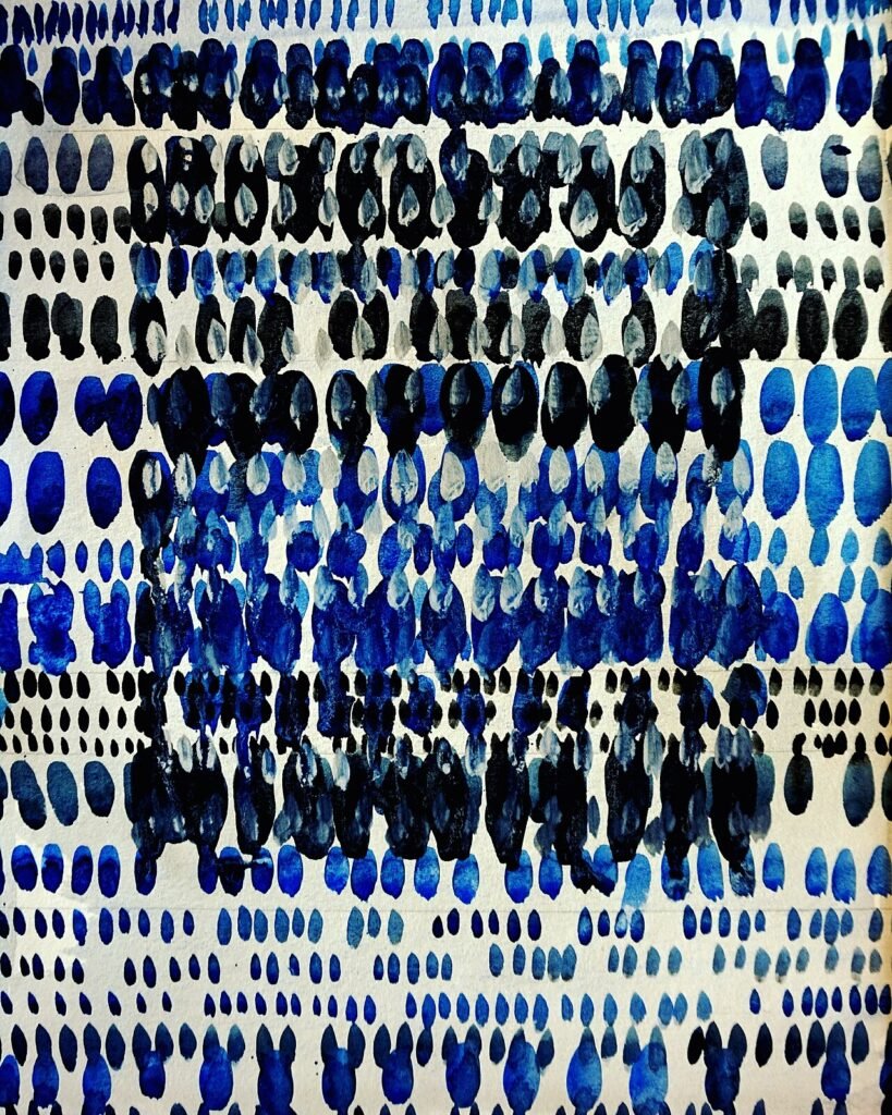
A large navy abstract gives a living room a clear focal point without needing a busy pattern. Hang it above the sofa, centered, with a plain wall around it so the color can breathe. Navy pairs well with cream, tan, and warm wood, and it grounds a room that otherwise feels light and floaty. Keep the rest of the wall simple, and let the abstract do the talking.
2. Soft Sky Prints for a Calm Bedroom
Sky blue prints help a bedroom feel restful, especially when paired with white bedding and pale wood. Choose a soft watercolor or a gentle landscape, and hang a pair above the bed or one larger piece on the main wall. Avoid very bright blues in a bedroom, since they can feel energetic when you want to wind down. Soft shades, on the other hand, feel like a clear morning.
3. Coastal Blue Seascapes for a Bathroom
A bathroom suits coastal blue art, from simple wave prints to calm seascape paintings. The blue echoes water without needing a beach theme, and it pairs well with white tiles and chrome fittings. Keep the frame simple and the glass easy to wipe, since bathrooms get steamy. One medium print above the towel rail or beside the mirror is usually enough.
4. Bright Blue Botanical Prints for the Kitchen
Botanical prints in bright blue add life to a kitchen without competing with food and cooking. Hang a small set near a breakfast nook or on the wall beside open shelves, where they can be enjoyed while you wait for the kettle. Blue botanicals pair well with white cabinets, wooden boards, and green plants, and they wipe clean if you keep them away from direct stove splashes.
5. A Teal Gallery Wall for the Hallway
A hallway is a good place for a gallery wall, since you pass through it often but never sit and stare at it. Mix teal prints, photos, and small abstracts in matching frames, and hang them in a loose grid at eye level. Teal sits between blue and green, so it suits hallways that connect rooms of different colors. Keep the spacing even, and step back often while hanging.
6. Dusty Blue Landscapes for a Home Office
A home office needs art that calms without distracting. Dusty blue landscapes, with soft hills or quiet water, give your eyes a rest during long work sessions. Hang one piece where you can see it from your desk without turning around, and keep the frame simple so it does not compete with your screen. Dusty blue also pairs well with wood desks and black office chairs.
7. Bold Cobalt Art for a Dining Room
A dining room can handle bolder color than a bedroom, since you use it for shorter, livelier gatherings. A cobalt print above a sideboard or on the main dining wall adds energy and pairs well with white table linen, brass candles, and dark wood. One bold piece beats a wall of small bold pieces, which can feel noisy when people are trying to talk.
8. Pale Blue Nursery Art for a Baby’s Room
Pale blue art suits a nursery when it stays soft and simple, such as gentle animals, clouds, or quiet landscapes. Hang prints out of reach of small hands, and choose frames with secure fixings. Soft blue pairs well with cream, pale gray, and natural wood, and it works for a nursery that you want to grow with the child rather than redecorate in a year.
9. Indigo Textile Art for a Reading Nook
Textile art in indigo, such as a woven hanging or a framed fabric print, adds warmth and texture to a reading nook. The deep blue feels cozy next to a chair and a lamp, and the fabric softens a corner that might otherwise feel hard. Hang it where it will not catch on a chair back, and keep it out of direct sunlight so the color stays rich.
10. Blue and White Porcelain-Style Prints for Classic Rooms
Blue and white prints echo classic porcelain patterns and suit traditional rooms with wood furniture and patterned rugs. A set of three matching prints above a console or a sideboard looks timeless without feeling old-fashioned. Keep the frames simple and white or dark wood, and let the blue pattern be the main detail in the room.
11. Turquoise Abstracts for a Bright Entryway
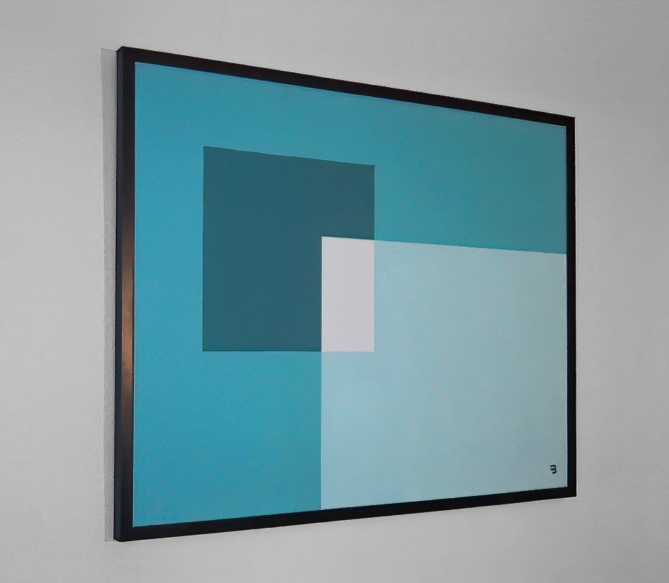
An entryway benefits from a bright, welcoming color, and turquoise fits that job well. A turquoise abstract near the front door gives guests a cheerful first impression and pairs well with white walls, a wooden bench, and a basket for shoes. Keep the piece at eye level, since entryways are seen in passing, and avoid very large frames that block the walkway.
12. Midnight Blue Photography for a Moody Study
A study or library suits midnight blue photography, such as night skies, dark water, or city lights in blue tones. The deep color feels thoughtful and quiet, which suits reading and focused work. Hang one large photograph above a desk or bookshelf, with a simple black frame, and pair it with warm lamp light so the room feels cozy rather than cold.
13. Blue Geometric Prints for a Modern Apartment
Geometric prints in blue suit modern apartments with clean lines and simple furniture. Bold shapes in navy, sky, and white add structure to a plain wall without needing a busy scene. Hang a pair of matching geometrics above a sofa or bed, aligned and evenly spaced, and keep the rest of the wall bare so the shapes stand out clearly.
14. Sea-Glass Blue Art for a Relaxing Guest Room
Guest rooms should feel calm and welcoming, and sea-glass blue is a gentle choice. A soft, watery print above the bed or dresser pairs well with white bedding, pale wood, and a simple lamp. Guests will notice the color without feeling overwhelmed by it, and the room will photograph well if you ever list it or share it with friends.
15. A Trio of Blue Shades for a Stairwell
A stairwell is often forgotten, but it is a good place for a trio of prints in light, mid, and dark blue. Hang them stepping up with the stairs, at a height that feels natural as you climb. The gradual shift from pale to deep blue draws the eye upward and makes the stairwell feel like a designed space rather than a passage you rush through.
Pairing Blue Wall Art with the Rest of the Room
Blue pairs well with many colors, but the pairing changes the mood. White and cream keep blue feeling fresh and coastal. Warm wood and brass make navy feel rich and classic. Gray makes pale blue feel calm and modern, while a touch of mustard or terracotta warms up a cool blue wall. Pick one pairing and repeat it in cushions, throws, or a rug, so the art feels connected to the room.
Lighting changes blue more than most colors. Under warm lamps, navy looks softer and sky blue looks warmer, while under cool daylight, the same prints look crisper and brighter. If you can, add a picture light or a well-placed lamp near a large piece, so it looks good in the evening as well as the day. Avoid hanging valuable prints in direct sun, since strong light can fade colors over time.
Blue Wall Art for Renters and Small Budgets
Renters can enjoy blue wall art without damaging walls or spending a lot. Removable hooks, picture ledges, and leaning a framed print on a console all work well, and they let you take the art with you when you move. A good print in a simple, plain frame also suits a small budget, since it often looks better than an expensive frame around a print you do not love. Start with one piece you truly like, and build around it slowly.
For a low-cost start, look for blue wall art in open editions, local markets, and secondhand shops, where you can find prints with character for far less than gallery prices. A simple white mat inside a plain frame can lift an affordable print a great deal, making it look finished rather than temporary. Blue wall art bought this way also lets you try a shade, such as teal or navy, before you commit to a larger piece for the main living wall.
If you are unsure about a shade, live with a smaller piece first. Blue wall art in a hallway or bedroom can test how a color feels in your light, and you can move it to the living room later if it works. This slow approach beats buying a large piece in a hurry, and it means every print on your walls is one you chose on purpose, not one you settled for.
Common Mistakes to Avoid
The most common mistake is hanging art too high. When a print floats near the ceiling above a sofa, it looks disconnected from the furniture. Center it at eye level, or a hand’s width above the furniture it sits over, so the art and the furniture read as one group. Another mistake is choosing a print that is too small for the wall, which makes a large room feel unfinished even when the art itself is lovely.
People also mix too many blues without a plan. One wall of navy, one of turquoise, and one of sky blue in the same sightline can feel scattered. Pick a main shade for each room, and use other blues as small accents in cushions or throws. Finally, do not hang art with weak fixings on a wall above a bed or a sofa. Use the right hook for the weight, and check it now and then, especially in a busy family home.
Summary Table: Blue Wall Art at a Glance
| Idea | Best Room | Shade |
|---|---|---|
| Navy abstract | Living room | Navy |
| Sky prints | Bedroom | Sky blue |
| Coastal seascapes | Bathroom | Coastal blue |
| Botanical prints | Kitchen | Bright blue |
| Teal gallery wall | Hallway | Teal |
| Dusty landscapes | Home office | Dusty blue |
| Cobalt art | Dining room | Cobalt |
| Nursery art | Baby’s room | Pale blue |
| Indigo textile art | Reading nook | Indigo |
| Porcelain-style prints | Classic rooms | Blue and white |
| Turquoise abstracts | Entryway | Turquoise |
| Midnight photography | Study | Midnight blue |
| Geometric prints | Modern apartment | Navy and sky |
| Sea-glass art | Guest room | Sea-glass blue |
| Trio of shades | Stairwell | Light, mid, dark |

Frequently Asked Questions
What shade of blue wall art suits a small room?
Pale and mid blues suit small rooms best, since they feel open and do not weigh the walls down. A single medium print with plenty of white space around it works better than a large dark piece, which can make a small room feel closed in. Keep the frame light as well, so the whole display stays airy.
How high should I hang blue wall art above a sofa?
Hang the center of the piece at eye level, roughly a hand’s width above the back of the sofa, so the art and the sofa feel connected. For a large piece, the bottom edge usually sits about six to eight inches above the sofa back. Step back and check from across the room, since that is how you will see it most often.
Does blue wall art go with gray walls?
Yes, blue and gray pair well, especially pale blue with warm gray and navy with cool gray. The key is contrast: a print that is clearly lighter or darker than the wall will stand out, while a print too close to the wall color can disappear. A white mat inside the frame helps separate the art from a gray wall.
Can I mix blue wall art with other colors?
Yes, if one color leads. Let blue be the main color in the art, and use other colors as small accents in the room, such as a mustard cushion or a terracotta pot. Mixing many strong colors in the art itself can feel busy, so look for prints where blue dominates and other colors play a supporting role.
Is blue wall art good for a north-facing room?
Blue can feel cool in a north-facing room, which gets less warm sunlight. Choose warmer blues, such as teal or turquoise, or pair a navy print with warm wood, brass, and warm lamp light. Avoid very pale, icy blues in a cold-feeling room, since they can make it feel colder.
How do I build a blue gallery wall without it looking messy?
Use matching frames, even spacing, and a clear layout, such as a grid or a single row. Start with the largest piece in the center or at one end, then add smaller pieces around it. Lay the arrangement on the floor first, take a photo, and adjust before you put any hooks in the wall.
Should blue wall art match my sofa or my rug?
It should relate to the room, not match exactly. Pick up one blue tone from the rug or a cushion, and let the art carry that tone in a larger, clearer way. An exact match can feel flat, while a related shade feels layered and natural. If your sofa is neutral, almost any blue will work, so choose the shade you love most.
How do I protect blue wall art from fading?
Keep prints out of direct sunlight, use glass or acrylic with UV protection for valuable pieces, and avoid hanging art above radiators or in very damp spots. Rotate prints now and then if a wall gets strong sun, and dust frames gently so the colors stay clear over time.
Final Thoughts
Blue is a generous color. It can calm a bedroom, freshen a kitchen, ground a living room, and welcome guests at the front door, all without shouting. Pick the shade that suits the room and the light, hang it at the right height, and give it room to breathe. Start with one room, live with the piece for a few weeks, and you will know quickly whether blue is your color. In our house, it certainly is.
Also Read: 15 Bedroom Wall Art Ideas for a Calm, Beautiful Room
Also Read: 15 Best Wooden Wall Art Ideas for Warmth in Any Room
Also Read: 15 Best Wall Mirrors for Dark Rooms (No Windows Needed)

Founder of NestFlavors — sharing tested recipes and honest home ideas, made for real life.